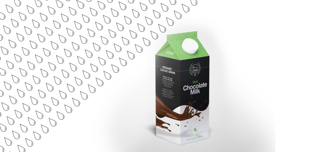


Packaging Design

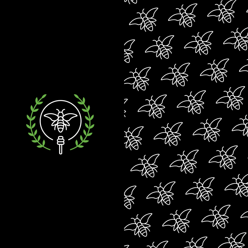
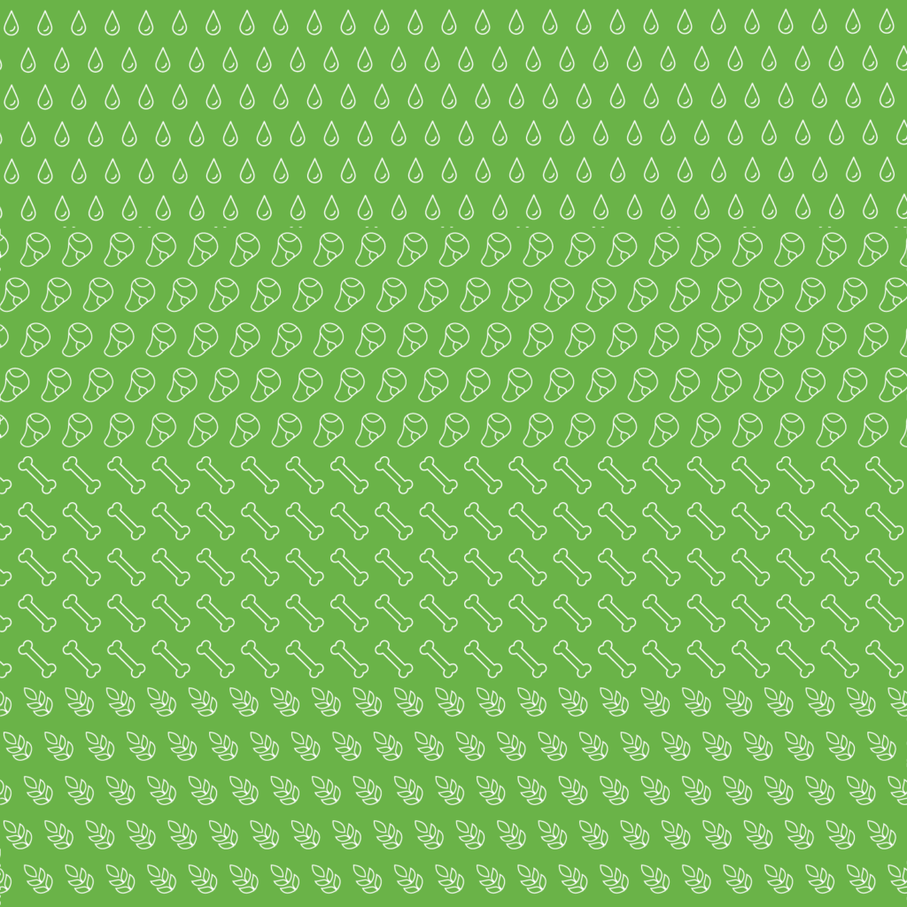
Pattern Design

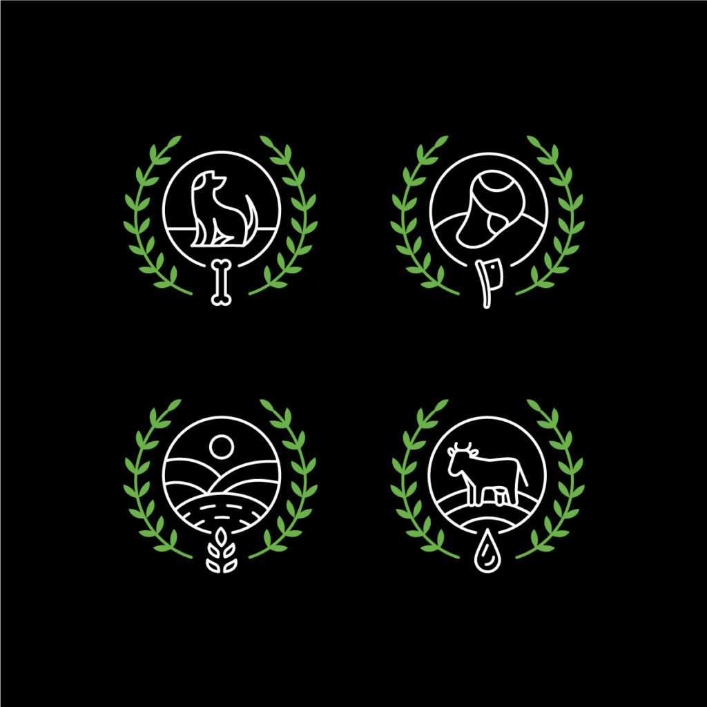
Icon Design
LIFE — CBD Infused Product Packaging
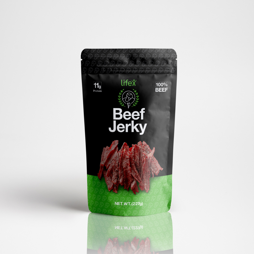
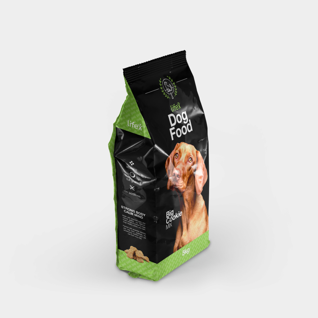
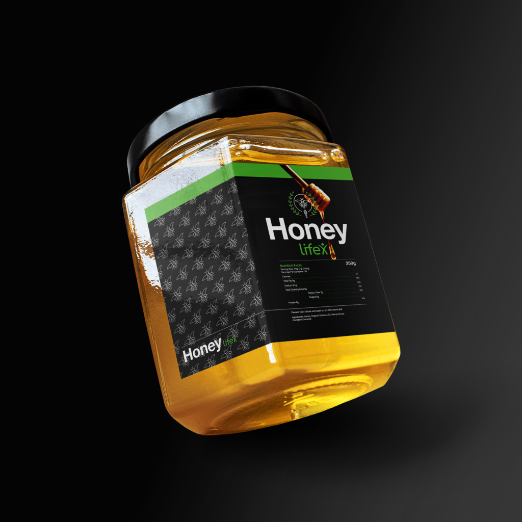
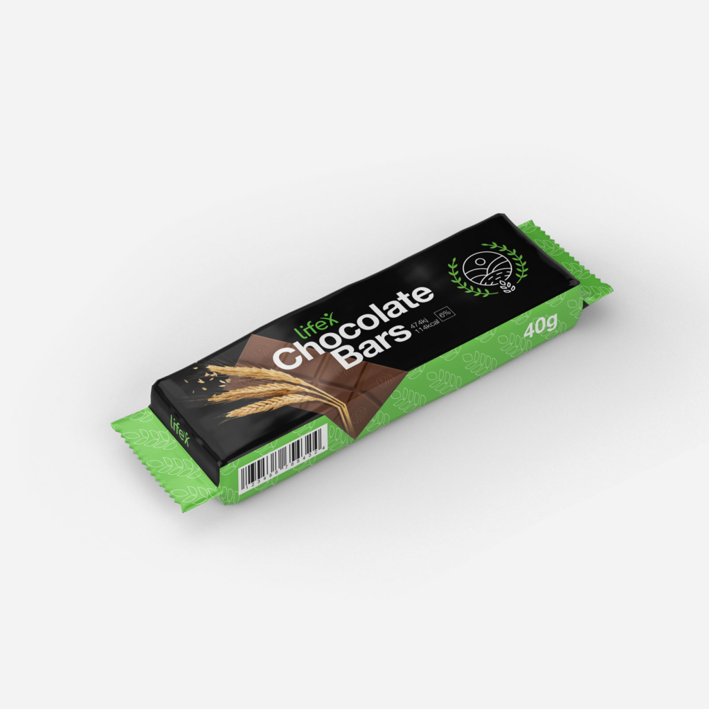
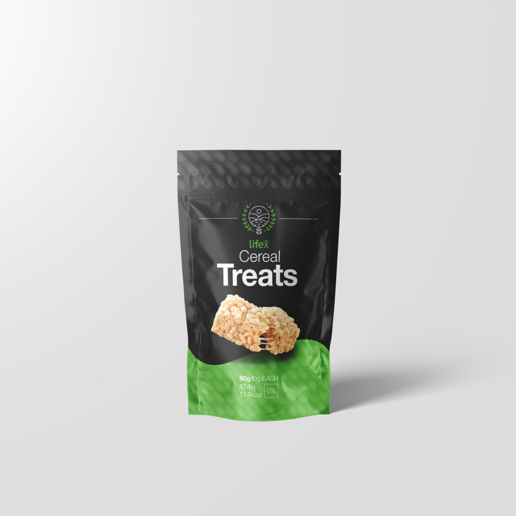
The LIFE packaging line was designed with a modern and minimal visual identity, built around a strong contrast of black and neon-accent green.
Each product combines clean typography, line-based icons, and pattern details, giving the brand a consistent yet flexible system across a wide range of goods.
Result
The LIFE packaging system successfully unifies a diverse product range under one clear visual identity. From chocolate milk to dog food, each item feels part of the same family while keeping its own character through tailored details. The bold black-and-green palette ensures strong shelf presence, while clean typography and minimal layouts communicate trust and modernity.
The result is a packaging line that stands out as premium, consistent, and approachable, helping LIFE position itself as a recognizable brand in the growing CBD market.
Design Style
LIFE’s packaging style is bold and minimal, with black surfaces, neon green accents, and clean typography. Each product carries subtle pattern details and simple icons, adding individuality while keeping the range consistent. The result is a fresh, modern look that feels premium yet approachable.