

Logo Design

Buisness Card
Design
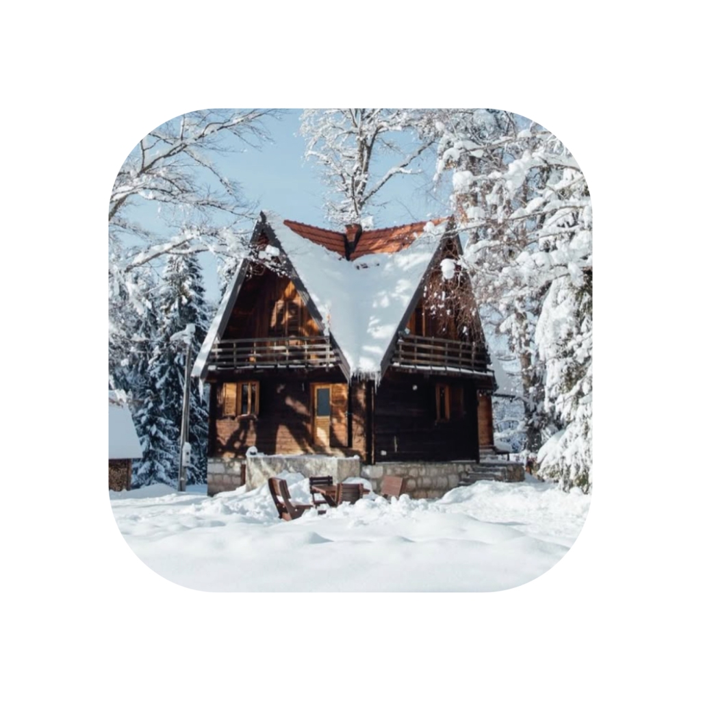

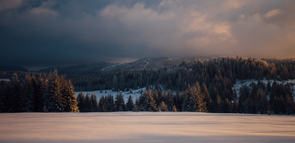
Šumska Koka is a mountain cabin accommodation nestled in Tara Mountain, Serbia.
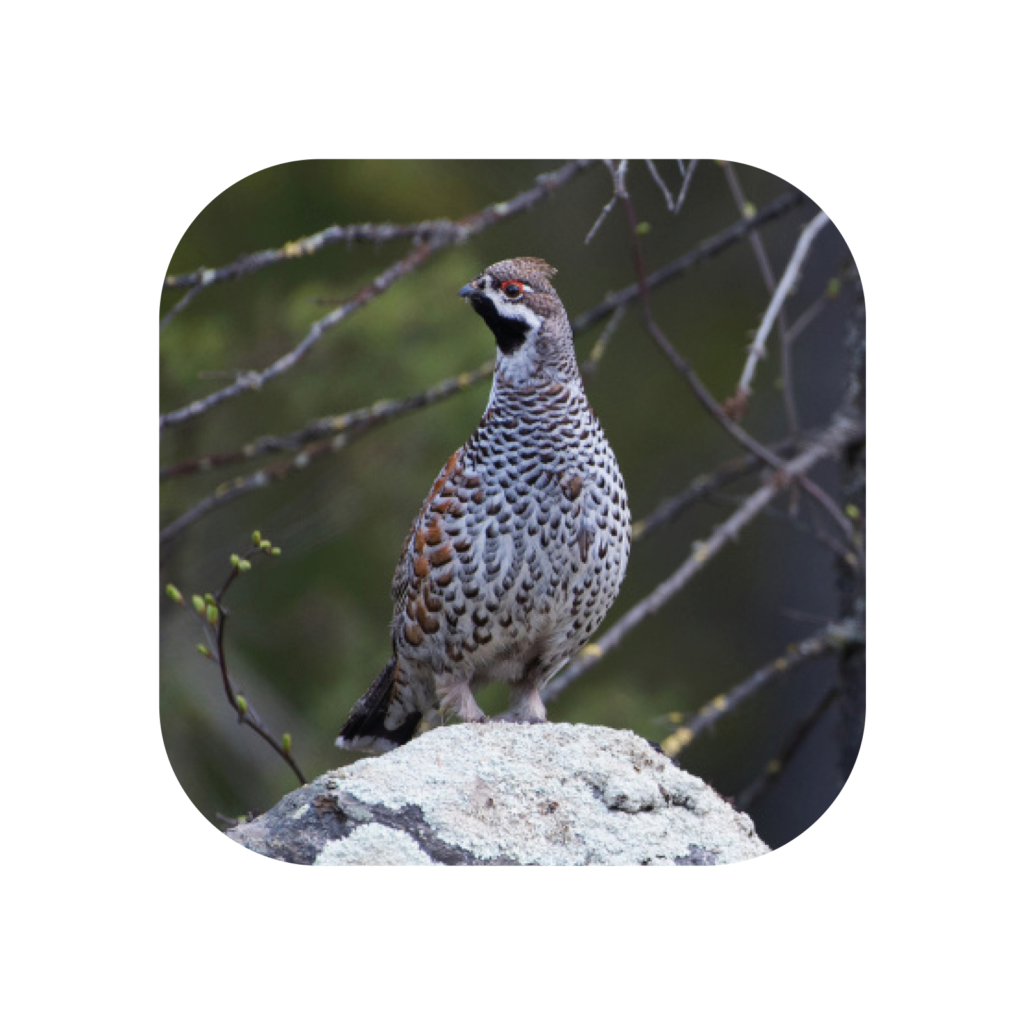
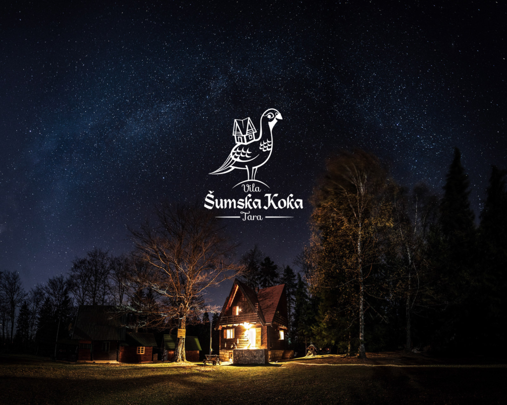
The name and visual identity draw inspiration directly from the bird (Hazel Hen) that inhabits the surrounding forests, symbolising nature, shelter, and the quiet life of the mountain.
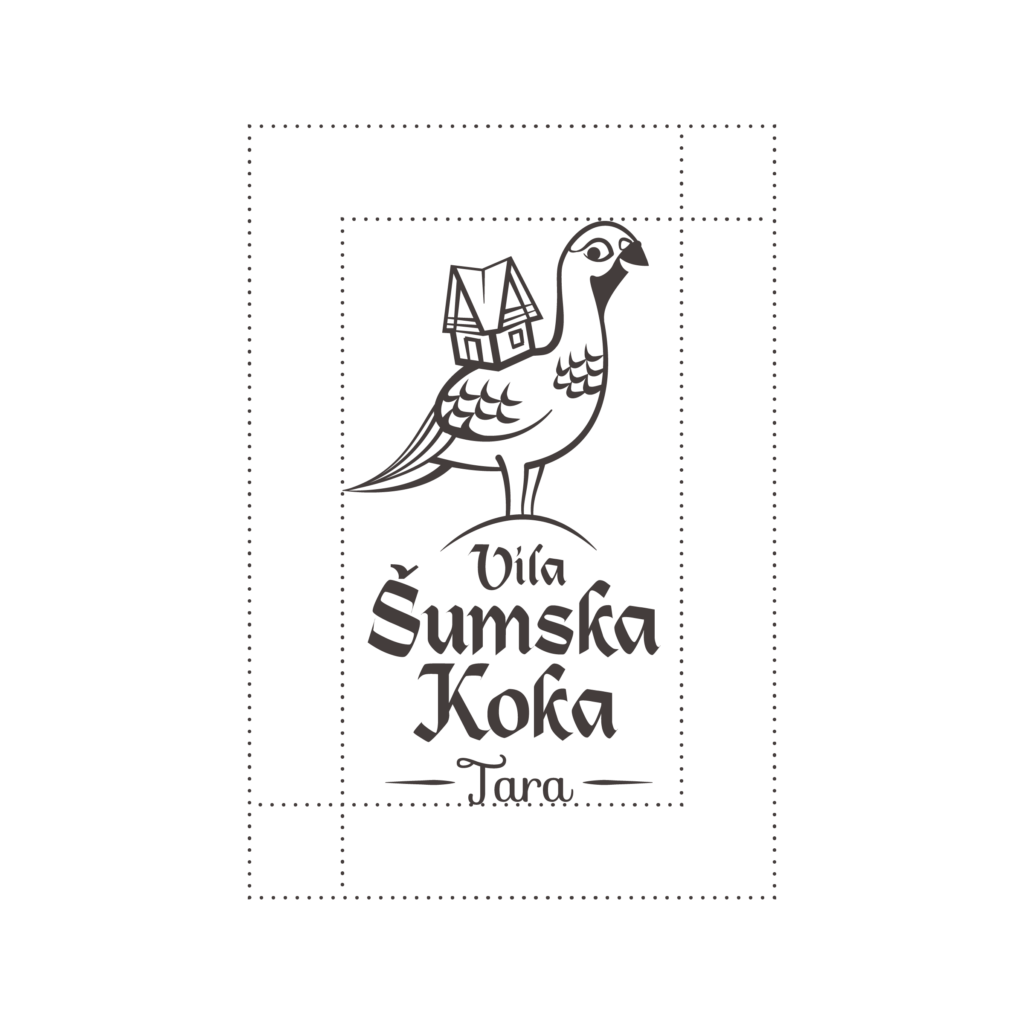
The identity captures the balance of nature and shelter through a simple, memorable mark.
Result
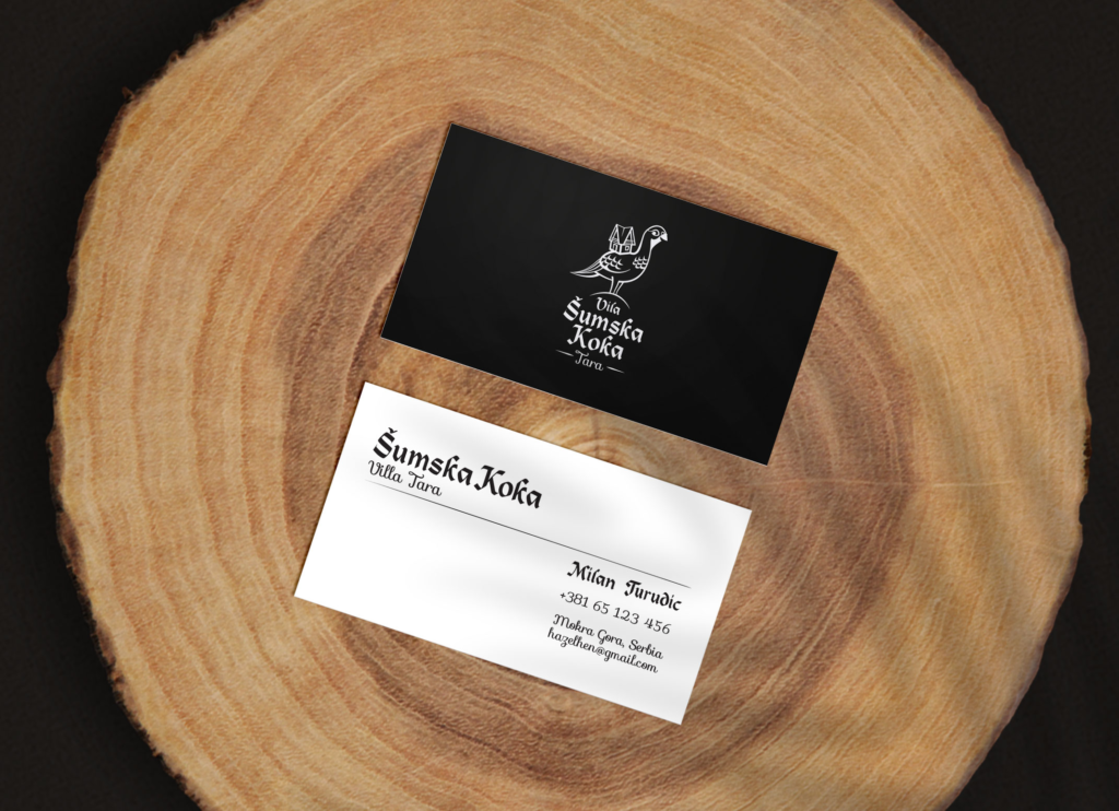
The project delivered a clear and memorable identity for Šumska Koka, centered around the Hazel Hen logo and a minimal business card design. The brand feels rooted in Tara’s forest while staying simple enough to adapt across print and digital use.
Concept
A clean, hand-drawn emblem of the Hazel Hen with a cabin merges local wildlife with architectural form. The hand-drawn lines give it warmth, while the clean form keeps it recognizable and easy to use on anything from business cards to signage.